Accessible Version Control Change Indicators
Designing accessible change indicators for Visual Studio to enhance code management for developers with disabilities.
Category
UX Design, Accessibility
Role
Senior UX Designer
Client
Microsoft
Year
2021
Project Overview
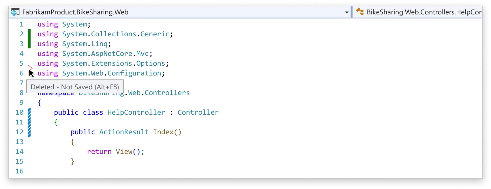
The code change indicators mark lines that have been modified, added, or deleted in the code file. The existing indicators in Visual Studio's version control system were not accessible for all users, and didn't provide change type information, being inconsistent with, for example, VS Code. I led the redesign work to ensure they were accessible and usable by all developers, regardless of their visual abilities.
UX Problem
• The indicators had 2 visual states changed-not saved (yellow bar), and changed-saved (green bar) represented only by color. • Different kinds of changes (addition, deletion, modification) don't have unique indicators. • Imparity with Visual Studio Code. • Not accessible for vision impaired users. • Color contrast ratio is not sufficient for passing WCAG standards. • Some vision impaired users can’t distinguish unsaved changes from saved changes. • The change margin indicators don’t follow the Git status.
Objectives
• Align implementation with other Microsoft products. • Follow more industry standard style for code change indicators. • Make sure that the new implementation is fully accessible and passes the WCAG rules and Microsoft Accessibility Standards. • New design needs to support Line Staging feature the was being designed in parallel. • Design for both light and dark themes.
Design Process
First we conducted user research and usability testing with developers with visual impairments to understand their needs and challenges with the existing indicators. Collaborated with accessibility experts to ensure compliance with accessibility standards and guidelines. I explored various design options, including patterns, shapes, and textures, to create indicators that were easily distinguishable by all users. I developed prototypes and shared those in the community feedback tickets and user testing. I refined the designs based on the feedback from users and experts.
Design Iterations
We went through multiple design iterations to explore different visual representations. I tested various shapes, patterns, and color combinations to ensure that the indicators were easily distinguishable by all users. I also considered the overall aesthetics and how the new indicators would fit within the existing Visual Studio interface.
Final Design and Impact
The final design was successfully implemented in Visual Studio 2022 version 17.3 and later. The design met all the set objectives and received positive feedback from users, particularly those with visual impairments.
I submitted a patent application which was accepted and I received a patent award for the design work.
Some users still preferred the old design due to familiarity, and we provided an option to switch back to the previous design if desired. Even then, the yellow and green color values were updated for better contrast and accessibility.
Related
The line staging feature that I designed as well uses the new style code change indicators. Blog post by my partner program manager: Interactive Line Staging